Patients use the mobile app to track their health journey. If anything irregular is reported, care providers are notified via the web app so the issue can be addressed as soon as possible.
Vitals Data Visualization
Recording and tracking vitals is integral to the platform. This data needs to be visualized for both our distinct user bases. To reduce development costs, we utilized the same visualization on both platforms. This provided a unique challenge, as the same data visualization needed to be easily understandable by novice (patients) users, while also providing value to our expert (care providers) users.
We conducted usability testing with users in both categories. Medical professionals were much faster to figure out the graphs, while patients needed time to understand the information.
In addition to recent vital readings, we wanted to showcase target values. The initial designs visually represented warning and critical breakpoints with faded lines. Confusion behind their meaning along with poor contrast caused issues with users.
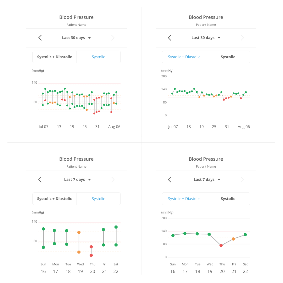
Blood pressure was particularly difficult because it is expressed as the combination of its two values: systolic and diastolic. Each of these values has its own target values. While medical professionals are familiar with this, patients often did not have a clear understanding prior to exposure with our graphs.
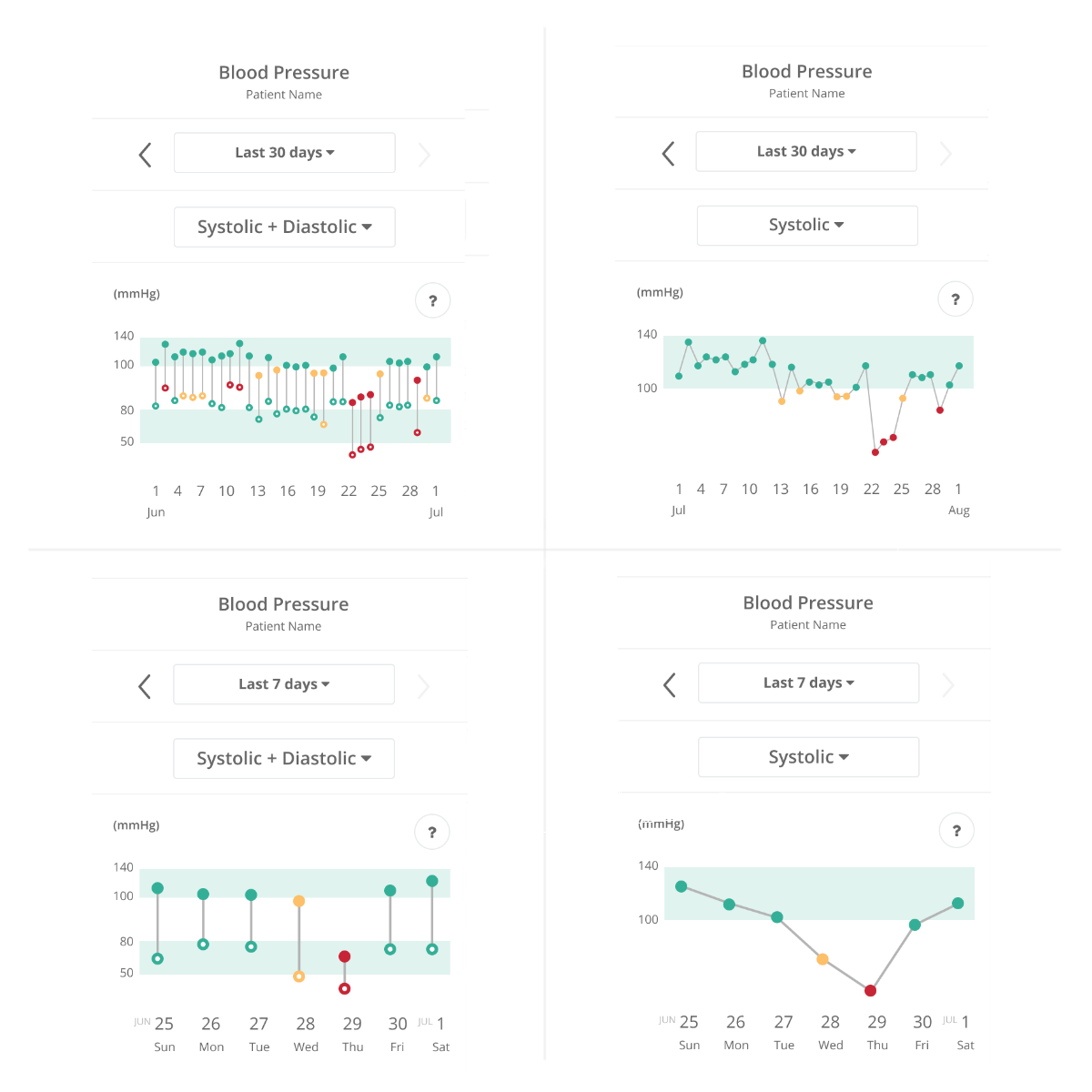
To solve these issues, we switched to highlighting the entire area of healthy values. We added a legend, including the value ranges. After hearing feedback, we realized we needed to adjust our color scheme to be color blind friendly.
Patient Summary Reports
Care providers on Veta Health’s platform needed the ability to view summarized information, for both individual patients and groups of patients suffering from the same conditions. Unlike the data visualization project, these reports are catered exclusively to the care provider side; therefore, we were designing for an expert audience.
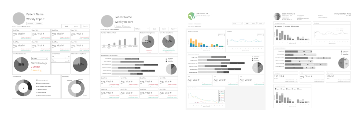
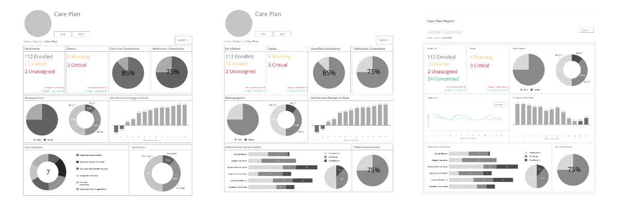
Through our original conversations with users, we learned that care providers often print graphs, which we accounted for in the data visualization designs. However, while observing care providers, we noticed the majority printed charts in black and white. In order to create an ideal experience for both web and print, we needed to create different color schemes for each.
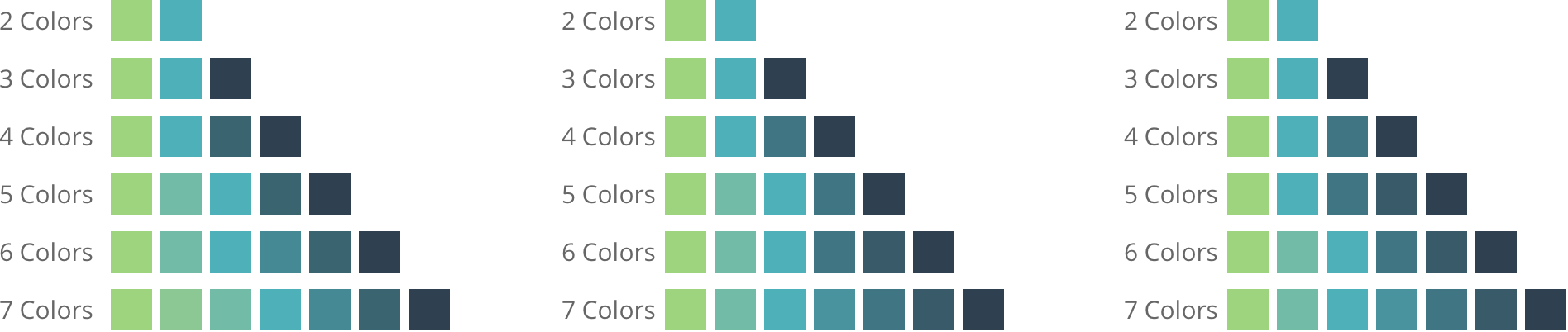
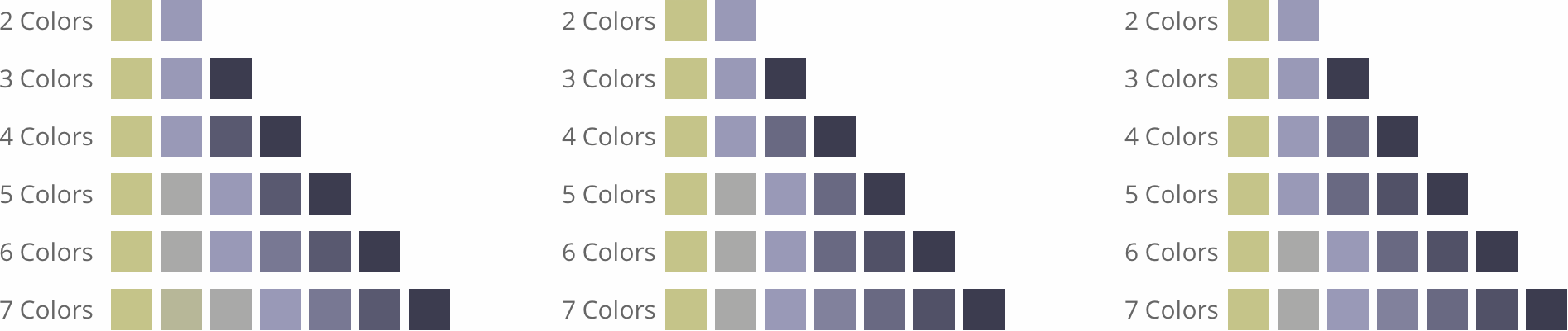
Web
Graphs utilize stoplight colors when there are clear positive, neutral, and negative data points. For non-categorizable and larger data sets, we needed something different. It should visually match the Veta Health platform, while also being easily readable for everyone, including color blind users. We defined our edge case as a maximum of 7 items per graph, so we needed a flexible set of 7 colors. Experimentation led to a set based on breakpoints of a gradient of the brand and interface colors. The flexible system prioritizes readability, utilizing the most distinguishable set of colors at each data point count. Below are variations of the prioritization in the 5 and 6 color sets. The middle option was the final selected set.
Having a set of 7 shades of gray was nearly indistinguishable. Further exploration and ideation produced our solution: pattern fills. Focusing on black and white readability, iterative testing helped us identify specific patterns to use.
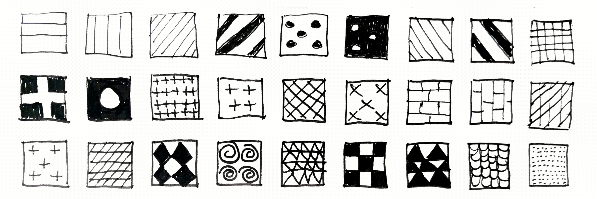
We then narrowed down the patterns to a set of 7 easily distinguishable patterns. After plugging them into a graph, we realized having 7 patterns was quite overwhelming. To combat this, we defined a set of 3 shades of gray to use in conjunction with 4 patterns. Shades of gray are prioritized over patterns to minimize patterns usage.